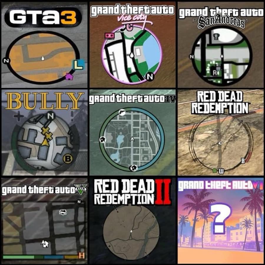
This image showcases mini-maps from several notable Rockstar Games titles, providing a visual evolution of the in-game navigation systems across different eras and franchises. The comparison reveals how Rockstar’s mini-maps have adapted over time, reflecting the gameplay, setting, and era of each game. Here’s a detailed breakdown of the differences and similarities between these mini-maps:
1. GTA III (Top Left)
Style: Basic and minimalistic.
Details: The map shows roads in a flat, blocky format, with a simple directional arrow indicating the player’s orientation. The color scheme is muted, with a solid background and yellow-orange roads.
Game setting: Urban, early 2000s, reflecting the limitations of early 3D open-world games.
2. GTA: Vice City (Top Center)
Style: Neon and stylized.
Details: The map incorporates a vibrant color palette—bright pinks and blues—reflecting the game’s 1980s Miami-inspired aesthetic. Key locations are outlined with more distinct shapes and colors, showing more stylization.
Game setting: Tropical and colorful, fitting the flashy, vibrant tone of the game.
3. GTA: San Andreas (Top Right)
Style: Slightly more detailed than its predecessors.
Details: The roads and environment are more defined, with a black-and-white theme that adds sharper contrasts. There’s a more modern layout of map icons (safe houses, missions, etc.).
Game setting: A larger world, covering city, rural, and desert areas, which reflects a broader game scope.
4. Bully (Middle Left)
Style: Quirky and cartoonish.
Details: The map is circular, fitting the game’s schoolyard setting. Icons for important locations (like the yellow “X”) are more prominent, using bright colors and playful designs. The navigation is still simplistic but more playful.
Game setting: A smaller, more contained world, reflecting the academy environment of the game.
5. GTA IV (Middle Center)
Style: More realistic and modern.
Details: The mini-map here incorporates a higher level of detail, with a clearer depiction of roads, buildings, and even water bodies. The use of shading gives more depth, reflecting the game’s more serious and gritty tone.
Game setting: Dense, detailed urban environments reflecting the gritty, realistic vibe of Liberty City.
6. Red Dead Redemption (Middle Right)
Style: Rustic and Western-themed.
Details: The mini-map is sepia-toned to fit the Old West aesthetic. It reflects open, natural environments rather than the grid-based city maps of GTA. Landmarks and topography are more important here than roads.
Game setting: Expansive wilderness and open prairies, emphasizing the wide-open spaces of the American frontier.
7. GTA V (Bottom Left)
Style: High-definition and very modern.
Details: This map brings greater detail and precision, with a zoomed-out view that shows multiple layers of roads and neighborhoods. Colored icons indicate missions, shops, and other activities. It’s more polished and clean, reflecting the technical advancements in open-world game design.
Game setting: A sprawling, highly detailed modern-day city with a diverse range of environments (urban, suburban, and natural).
8. Red Dead Redemption II (Bottom Center)
Style: Highly textured and immersive.
Details: The mini-map is similar in theme to the original Red Dead Redemption but far more detailed, showing subtle gradients for hills, trees, and paths, reflecting a more intricate and refined approach to natural landscapes.
Game setting: A more dynamic, living world with a focus on immersion and realism, fitting the game’s epic, story-driven journey across diverse wild terrains.
9. GTA VI Placeholder (Bottom Right)
Style: Placeholder, nostalgic.
Details: The question mark suggests a mystery, but the backdrop of palm trees and a sunset seems to harken back to Vice City’s aesthetic, implying a possible return to Miami-like environments for the next GTA installment.
Game setting: As of now, this is speculative, but the color scheme and style suggest a vibrant, tropical environment, possibly returning to the 1980s or something similarly stylized.
Summary
Rockstar Games has progressively refined its mini-maps, moving from basic, functional designs to more immersive and detailed representations of the in-game world. The early games like GTA III feature blocky and minimalistic maps, while more recent titles like Red Dead Redemption II and GTA V showcase much richer and more precise cartography, matching the more complex and detailed open-world environments. Each mini-map reflects the unique tone and setting of its game, whether it’s the neon lights of Vice City, the schoolyard of Bully, or the rugged frontier of Red Dead Redemption. The placeholder for GTA VI teases a future evolution, possibly blending the vibrant aesthetics of the past with the cutting-edge technology of modern gaming.